Inclusive and Accessible Course Design
Our University community includes over 2000 disabled students. Inclusive and accessible online course design and delivery can help ensure these students are able to fully participate in their studies. Designing a course with inclusivity and accessibility in mind results in a course that provides a better online experience for ALL students.
Recently Disability Services at Victoria University of Wellington released the disability inclusion and accessibility
in digital course delivery guide, which is a recommended resource for learning more about this topic.
Recently Disability Services at Victoria University of Wellington released the disability inclusion and accessibility
in digital course delivery guide, which is a recommended resource for learning more about this topic.
These guidelines focus specifically on accessibility in a Te Herenga Waka - Victoria University of Wellington course but could be applied to many online environments. They are not a full list of inclusivity and accessibility considerations, but provide a good starting point:
Note that inclusivity and accessibility is an ongoing area of learning for many people, including us. While you may not achieve everything immediately, every change you make will be beneficial. The aspects that will benefit disabled students the most are: logical layout, being descriptive, captioning videos (and enabling transcripts if using Zoom), and creating accessible attachments.
Below are a series of links to websites that staff have found useful, check these out if you wish to learn more about this topic:
- Have a consistent and logical layout
- Give clear succinct instructions and communicate your expectations
- Consider colour contrast and its usage
- Use easily readable fonts (sans serif and 12pt at least) and in-built formatting tools to identify headings
- Add meaningful descriptions (alt text) to images and graphs
- Use descriptive hyperlinks
- Create accessible Word documents, PowerPoints and PDFs
- Add captions to video
Note that inclusivity and accessibility is an ongoing area of learning for many people, including us. While you may not achieve everything immediately, every change you make will be beneficial. The aspects that will benefit disabled students the most are: logical layout, being descriptive, captioning videos (and enabling transcripts if using Zoom), and creating accessible attachments.
Below are a series of links to websites that staff have found useful, check these out if you wish to learn more about this topic:
11 Easy Accessibility Improvements Checklist
|
Download the accessible PDF that lists 11 simple things that we can do to improve the accessibility of our courses online:
|
| ||
Templates and Structure
Blackboard templates
Templates can and should be used to establish a level of consistency for students across courses. A template gives a core structure to the course menu. It uses dividers and subheadings to structure content.
A Blackboard course template that complies with disability inclusive and accessible standards and recommendations has been created by CAD with input from Disability Services and used in an introductory Blackboard course for academics called Toiere. If a template is not already used in your faculty, chat to your colleagues and involve the team at CAD to adapt the Toiere design to one that meets the needs of staff and
students in your programme or faculty.
You can request a template be added to your Blackboard course via the Staff Service Centre.
|
Menu structure
We recommend the use of common subheadings in your course menu such as:
Note that what you choose to include as core sections underneath each subheading is up to you and will depend on how you decide to structure your content and the language used in your course.
All courses should, at a minimum, include:
Content structure
Once you have created the core sections of your course, develop a logical flow for your content within each section. Where necessary, use folders to group information.
Use descriptive names for your folders and add a short description to folders or files so students know what they contain. |
|
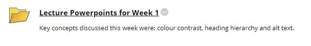
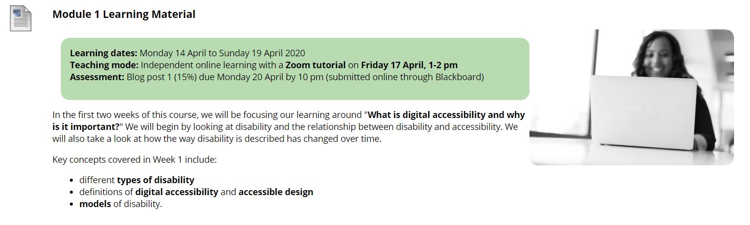
When creating content folders in your course content section it can also be helpful to add the relevant dates and assessment for that week or module in the folder description, as you can see in the example below.
Instructions and Information
In a well-designed Blackboard course, students should be able to navigate the course and easily work out what the course is about, what they need to do and when they need to do it by. Embedding clear instructions throughout your course will benefit all students and may also reduce the number of emails you receive. There are many ways you can achieve this goal. Get in touch with your faculty learning designer or academic developer to discuss how best to achieve this in your course.
Using Colour
Why does colour contrast matter?
Colour and colour contrast are very important topics when it comes to accessibility. The colours you choose to use can either enhance the accessibility of your course or make it almost inaccessible to students with certain vision impairments.
Colour contrast refers to the difference in the brightness or luminosity between the foreground and background colours. Essentially, if there isn’t sufficient contrast or difference in luminosity between these colours many students with low vision or various forms of colour-blindness might not be able to read the text.
Colour is a valuable tool for making your course visually appealing and interesting. However, consider using images to add colour, rather than adding colour to your text.
The default Blackboard colours of black or dark grey on white (or vice versa) have high colour contrast. Therefore, we recommend that you do not change the colours of the main course menu. If you wish to use colour headings within your sections, use colours that strongly contrast with the white background. Use only 2-3 colours rather than a rainbow of colours.
In particular, avoid using colours as the only means of conveying key information. For example, don’t write text in red to show it is important. If a student can’t easily identify that the text is red, they won’t know it’s important. If you wish to use colour to draw attention to certain pieces of information, use some other feature to highlight it as well (e.g. also put it in bold). Avoid writing whole paragraphs in colours other than black or dark blue, as some students may have difficulty reading them (particularly red or lighter colours).
Tip: online tools (such as WebAIM's Contrast Checker) allow you to enter background and foreground colours to check that they have sufficient contrast.
In summary:
- Use the default colours for the course menu.
- Avoid using colour as the only means of distinguishing between two or more pieces of information.
- Use a limited palette of 2-3 colours.
- Avoid writing sentences or paragraphs in red.
Fonts and Headings
Readable fonts and heading hierarchy
How text is formatted has a significant impact on the ease with which information can be accessed by learners.
For readability, we recommend the use of clear standard sans serif fonts e.g. Arial, Tahoma, Calibri (not Times New Roman or Comic Sans) and a minimum font size of 12 points.
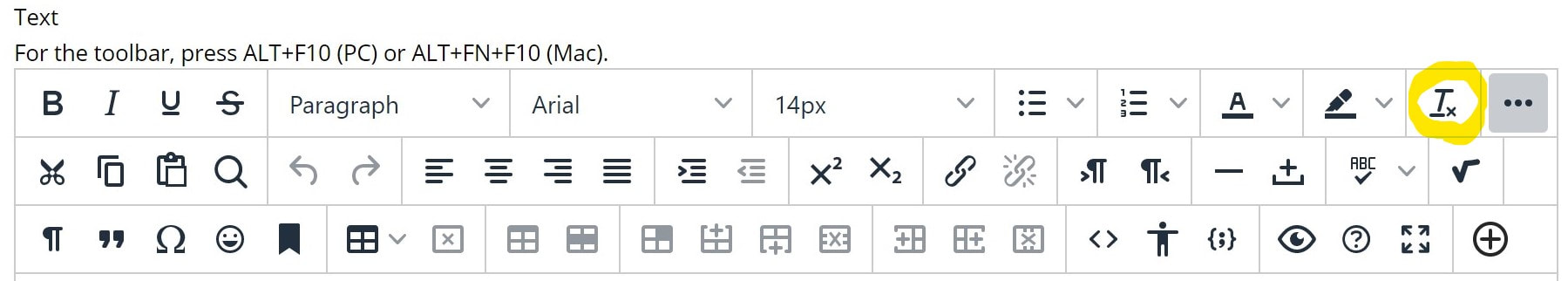
In Blackboard, it is recommended that you use the default text font and size, as this is designed for readability and will ensure a consistent look. If you are copying text over from elsewhere you will be asked to remove formatting when you paste or you can use the clear formatting tool to remove existing formatting, as shown below.
For readability, we recommend the use of clear standard sans serif fonts e.g. Arial, Tahoma, Calibri (not Times New Roman or Comic Sans) and a minimum font size of 12 points.
In Blackboard, it is recommended that you use the default text font and size, as this is designed for readability and will ensure a consistent look. If you are copying text over from elsewhere you will be asked to remove formatting when you paste or you can use the clear formatting tool to remove existing formatting, as shown below.
|
When you wish to add a formatting feature such as a heading or bullet points, use in-built tools to do this, rather than simply adjusting the size, colour or style of the text. This ensures that a screen-reader will recognise that it is a heading.
|
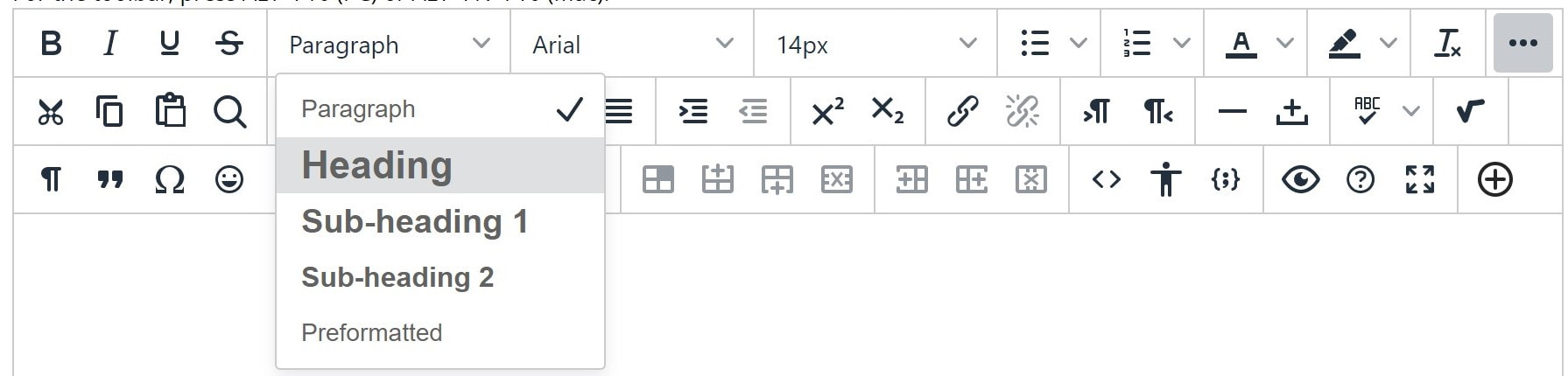
Also, make sure to order your headings in a logical order – the main heading should be identified as ‘Heading 1’, then subheadings should be ‘Subheading 1’ or ‘Subheading 2’ depending on their importance (as shown in the image below). Heading hierarchy is extremely important for helping people with vision disabilities easily navigate through a document.
When creating documents in Microsoft Word, PowerPoint or other tools, also use the in-built tools to identify headings. Note that you can modify these in terms of size, colour and font as you wish.
Below is an image of the heading styles bar in Microsoft Word (you can right click on each heading to modify its font, colour, size etc).
In summary:
Below is an image of the heading styles bar in Microsoft Word (you can right click on each heading to modify its font, colour, size etc).
In summary:
- Use standard sans serif fonts in at least 12 point.
- Ideally, use the default Blackboard font and font sizes.
- Identify your headings in order of importance using in-built tools in Blackboard, Word and PowerPoint.
- Clear formatting when copying and pasting material from elsewhere.
Images and Alt Text
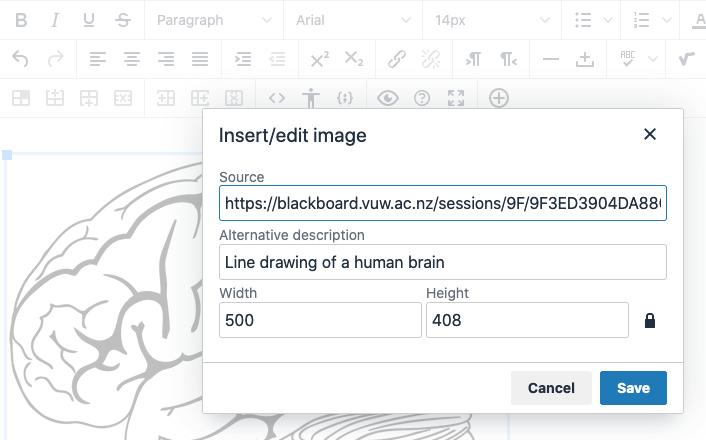
Alternative text (alt text) refers to a description that accompanies an image. Alt text can be added to any image in a course so that if a student cannot see the image, they will know what information that image provides. If a student is using a screen-reader because they are blind or have low vision, the screen-reader will read out the description of the image.
|
All images, graphs or diagrams in a course that are important for conveying information should have alt text added. If the image is purely decorative, it doesn’t need to have alt text.
In Blackboard, alt text is called ‘Alternative description’ and can be added by right-clicking any image in the editor – as you can see in the screenshot to the left. |
Banners that are added to the Announcements page do not need alt text if they simply include the name of the course and a decorative image. If they include information that is not elsewhere on the page, add alt text to them (you can do this when you upload the banner).
Finally, avoid adding tables or pdfs as images – these should be correctly formatted to ensure they are readable by screen-readers. Chat to the VUW Library or Disability Services to learn more about converting these to a readable format.
In summary:
Finally, avoid adding tables or pdfs as images – these should be correctly formatted to ensure they are readable by screen-readers. Chat to the VUW Library or Disability Services to learn more about converting these to a readable format.
In summary:
- Add a description (alt text) to meaningful images, graphs and diagrams in your course.
- Decorative items such as most banners don’t need alt text.
- Do not include tables or pdfs as images.
Hyperlinks
Use descriptive hyperlinks
Any hyperlinks included in your course should consist of meaningful words or phrases. Avoid the use of 'click here' and ‘for more’ type links. This is because when someone is navigating a page using a screen-reader they need to know where the link is taking them. They may search the page for a particular link by jumping from one hyperlink to another, if all the hyperlinks are 'click here' this is not very helpful. Make the words reflect the content the link is going to. The Victoria University of Wellington student services page has good examples of descriptive hyperlinks.
In summary:
In summary:
- Use meaningful words and phrases for your hyperlinks and avoid ‘click here’ type links.
Accessible Content and Resources
Readings
Ensure readings are uploaded to Talis. Talis can facilitate creating more accessible versions of documents.
Captioning videos
In recent years, captions have gone mainstream. While initially developed for people with hearing impairments, many people now use closed captions to access video when they are in public spaces without headphones or because it helps them to more easily process the information. Captions are of course still essential for those with hearing impairments.
All video at Victoria University of Wellington that is uploaded to VStream (Panopto) can have closed captions added. If the video has uploaded automatically from Zoom, it will automatically have closed captions enabled. If the video has been created within Panopto you can add captions by following the steps below. Note that these captions are computer generated so will need editing to be 100% accurate. It's recommended that you review the captions and check their accuracy before choosing to apply them. Their accuracy will depend on a number of factors including your accent, speed of speech, the language you are using (e.g. te reo Māori will not be recognised so should be checked in the captions). In shorter videos, such as welcome videos, reviewing the captions should only take a minute or two. For longer lectures, it's your choice as to whether or not you think they will be useful depending on how accurate the automatic captioning is.
Note that if you have a student in your course who has a hearing disability or other disability for which video captions are required, please contact CAD as there is provision for manual editing of captions to meet the learning needs of those students.
Panopto has also produced a video showing how to add automatic captions.
Audio transcripts are very useful for many students and can be automatically generated when recording using Zoom. If you wish to add these to your course, take the following steps:
You can now download this and add it to your Blackboard course or add it as a shareable link.
If audio transcripts are not enabled, turn them on under ‘Advanced cloud recordings’ in your Zoom settings.
All video at Victoria University of Wellington that is uploaded to VStream (Panopto) can have closed captions added. If the video has uploaded automatically from Zoom, it will automatically have closed captions enabled. If the video has been created within Panopto you can add captions by following the steps below. Note that these captions are computer generated so will need editing to be 100% accurate. It's recommended that you review the captions and check their accuracy before choosing to apply them. Their accuracy will depend on a number of factors including your accent, speed of speech, the language you are using (e.g. te reo Māori will not be recognised so should be checked in the captions). In shorter videos, such as welcome videos, reviewing the captions should only take a minute or two. For longer lectures, it's your choice as to whether or not you think they will be useful depending on how accurate the automatic captioning is.
Note that if you have a student in your course who has a hearing disability or other disability for which video captions are required, please contact CAD as there is provision for manual editing of captions to meet the learning needs of those students.
- Go to the ‘VStream videos’ section in your course and open Panopto by clicking on the square box with the northeast facing arrow on the right hand side of the page
- Once in the Panopto website, choose a video and click 'edit'
- Choose ‘captions’ on the left-hand menu
- Click the downward arrow next to ‘Import captions' and choose ‘import automatic captions’
- You can now edit the captions if you wish by typing directly into the captions boxes
- Click the green ‘Apply’ box in the top right corner
- Captions have now been added to your video.
Panopto has also produced a video showing how to add automatic captions.
Audio transcripts are very useful for many students and can be automatically generated when recording using Zoom. If you wish to add these to your course, take the following steps:
- Log in to your Zoom account at vuw.zoom.us
- Go to the recordings tab
- Click on the recording and it will open up the list of files – which includes audio transcript
You can now download this and add it to your Blackboard course or add it as a shareable link.
If audio transcripts are not enabled, turn them on under ‘Advanced cloud recordings’ in your Zoom settings.
Documents
See part 2 of the disability inclusion and accessibility in digital course delivery document for guidance on creating accessible Microsoft Word and PowerPoint documents.
If possible, consider making lecture slides and other documents available in multiple formats (e.g. ppt and pdf), as they have different accessibility pros and cons.
If possible, consider making lecture slides and other documents available in multiple formats (e.g. ppt and pdf), as they have different accessibility pros and cons.
